Monday, March 22, 2010

A glossy ceiling? Really?

One of the widely followed home design maxims is to avoid the glossy ceiling. Flat paint it is! And most of the time, the ceiling is white (a totally different subject).

I would like to differ.  I love the shiny ceiling! The way it reflects the room and makes is seem more spacious. It amplifies the available light and gives the ceiling a much lighter feel.  The glossy effect can have a full range of finishes, from the imperfect to the mirror-smooth.

apartmenttherapy.com


However, it does need to be pointed out that a high gloss finish will highlight any flaws in the surface. If absolute perfection is important to you, then either go flat or first have a plasterer / finisher skimcoat the ceiling so that it's smooth. Then the painter (you?) can roll on the finish coats.

I happen to believe that the imperfect ceiling surface adds character! If you don’t mind a little waviness or imperfections, then a high gloss paint, a metallic paint, metallic leaf or Venetian plaster can add a beautiful shimmer to lift the room.

 
Elle Decor Photograph by Eric Piasecki


Elle Decor Photograph by Eric Piasecki


If you're going to use paint for as smooth a finish as possible, you should use a foam or short-napped roller and try to keep a wet edge. Coarse naps leave texture, and a dry edge can leave visible lap marks. If you use a metallic paint or metallic glaze, try the microfiber rollers for metallic paint. And add a paint “extender” for additional “open time” that allows you to roll on the paint with more ease and slows down the drying time.

These glossy ceilings are to die for:
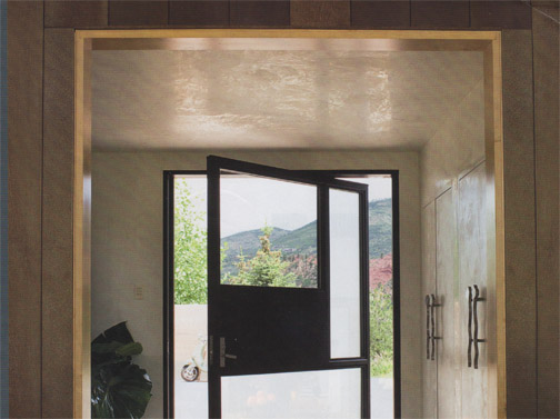
Metropolitan Home, Larry Laslo Designs


Veranda magazine Photograph by Peter Vitale


Silver leaf ceiling: John Saladino- Style by Saladino


Saturday, March 20, 2010

You Can Find Color Here (as in Peacock)

Do you dream in color like I do? One of my inspirations just happens to contain some of my fav colors in the fabulous, showy package known as the peacock. The brilliant blues, shades of green, accents of yellow, brown and black…

And (how timely) Pantone selected Turquoise as their color for 2010.


Did you know that the luminous, brilliant colors of the peacock feather do not come entirely from the chemical pigments, but rather from the structure of the feather itself? The straplike "twigs" which come off the branches of the peacock feather measure differently for each color region. These produce the peacock's iridescent hues, which shimmer and change, depending on the angle of light. The magnified feathers look like this:


Lately, I’ve seen the peacock feathers featured as a décor item. Perfect accents, wouldn’t you say?


Rouge Living peacock pillow


 Halycon carpet, Loomah's Roscoe Collection


You can find the peacock colors everywhere!


Great blue and green! Source unknown


Wednesday, March 17, 2010

What is scratch coat plaster anyway?

My favorite interior designer, John Saladino, recently featured scratch coat plaster walls in the January-February 2010 issue of Veranda magazine. The article, Saladino in SoHo, presented John’s designs, inspired by the Vermeer-based film Girl With a Pearl Earring, for the Veranda NYC show house.

Photography by Antoine Bootz in Veranda magazine


Photography by Antoine Bootz


Photography by Antoine Bootz


Saladino often features walls made with plaster that appear less “finished”.  He describes the walls as scratch-coat plaster or brown-coat plaster. What are they?

Back in the days before drywall, the walls in a home were made out of real plaster. The plaster application usually consisted of three steps: the scratch coat, followed by the brown coat and ended with the finish coat.

The first “scratch” coat (also called the intonaco) is embedded onto a wood lath (today metal lath is available which will not warp) and is the base coat. The scratch coat gets its name from the fact that it is physically scratched with horizontal marks. These scratches create the “key” for the next coat to grab onto. The second coat, the brown coat, is applied very thin and creates the flat surface for the finish coat. In Tuscany, this coat is called velo, meaning veil, since it is so thin. The final “finish” coat is a very thin coat that must be kept wet and troweled to a smooth, hard finish. When dry, it will be rock solid and shiny like marble. The finish coat is the thinnest of the coats, and its purpose is to impart a decorative surface to the plaster. The smoother the wall, the more labor involved.

Scratch, brown, and finish coats all have slightly different proportions. Scratch coats are mixed at 1 part cement to 2-1/4 to 4 parts sand, brown coats are mixed at 1 part cement to 3 to 5 parts sand, and finish coats are 1 part cement to 1-1/2 to 3 parts sand.

If you like that look, be sure to check out Saladino’s first book, Style by Saladino. It is full of similar looks. In one, he mixes instant coffee with the plaster and then dried it with the radiator turned on full blast to cause parts of the plaster to dry faster than others, causing the dried colors to vary.

Saladino's wall of brown scatch-coat plaster using
Saladino's wall of scatch-coat plaster using instant coffee with the plaster Photographer: Lizzie Himmel


Scratch coat plaster in John Saladino's book, Style by Saladino 


Axel Vervoordt, a fabulous Belgian designer, also favors walls that are more “natural”. Here he mixes lime with powder pigments and earth found locally on the property. Scratch coat plaster walls and these lime and pigment walls are both ancient and modern... and very "green".

From Axel Vervoordt's book, Timeless Interiors

Monday, March 15, 2010

Everywhere We Look: Yellow and Grey

Have you noticed lately how yellow and grey are one of the most popular go-to paint combinations? The color combo is often accented with black and / or weathered, bleached wood.

Yellow and grey can range from bold and bright to mellow and subtle to a well-tailored, clean and sophisticated.

[caption id="attachment_183" align="aligncenter" width="378" caption="Schumacher"][/caption]

[caption id="attachment_184" align="aligncenter" width="405" caption="From the Grandezza collection of JAB Anstoetz"][/caption]

[caption id="attachment_186" align="aligncenter" width="500" caption="Yellow and grey in Lee Jofa's Eric Cohler design"][/caption]

[caption id="attachment_188" align="aligncenter" width="376" caption="Sasha Adler in House Beautiful"][/caption]

Tuesday, March 2, 2010

Get Rid of Wallpaper Once and For All!


Off with the wallpaper! Here's what Frank Faulkner did:

Frank Faulkner is a Top 50 New York Designer, according to NY Spaces Magazine. He not only is a fabulous designer, but he is also a very talented artist. One of Frank's recent homes is now featured in the March 2010 issue of NY Spaces Magazine. The circa 1870 home is in Hudson, NY. Having removed the old wallpaper, Frank decided to leave the living room walls "exactly as they were when we tore the wallpaper off, he says, cracked plaster, patination, and all."

I was recently at a client's home where the wallpaper had been stripped. Personally, I loved how the walls looked without anything further being done to them. It's a matter of taste... wallpaper be gone!

Here are a few shots:

"Au naturelle" walls close up


Walls left "natural" after wallpaper removal

Sunday, February 14, 2010

Trompe L'oeil Class for DPAP members

[caption id="attachment_150" align="aligncenter" width="234" caption="Trompe L'Oeil class sample"]Trompe L'oeil striping class[/caption]

The Trompe L'Oeil Moldings Class comes to the Midwest with Marlow DeMars from the Decorative Painting Apprenticeship Program, DPAP, teaching.

On Saturday, April 10, 2010, Marlow will be teaching the art and mechanics of striping here at our studio!

This is a free workshop for DPAP paid members. Marlow will teach how to mix colors, (grisaille), and how to stripe on several types of moldings. The sample board you take home will contain a variety of moldings that can be used in many interior painted schemes.
A $25 materials fee is required for this workshop (for brushes, paint and boards).

DPAP, a non-profit pending program, was started in March of 2007 with the mission of providing real-world experiences for decorative painting artisans, as well as creating enduring art in public spaces consistent with the goals of public restoration programs. DPAP finds public buildings in need of repair and restoration, suggests design schemes, gathers professionals to teach classes on-site, and recruits students to execute the designs. Marlow DeMars , of Ingalls DeMars Painting in Connecticut, is a co-founder as well as being responsible for creating design schemes and presentation materials.

Please visit http://dpap.org/ for further information on joining DPAP!

Trompe l'oeil is definitely both an art and a science. Join this master to learn it!

Friday, February 5, 2010

Damask in glass and gold tiles

I LOVE this!
These glass and 24 carat gold mosaic tiles are arranged in a damask pattern that is fabulous!
Carlo Dal Bianco's "Damasco Oro Giallo" tiles are seen at the website: http://www.carlodalbianco.it/

Glass tiles are everywhere right now...

[caption id="attachment_144" align="aligncenter" width="223" caption="Gold and glass tiles in damask pattern"]glass tiles in damask pattern[/caption]

This inspired me to create a faux finish for an accent wall with a similar feel. My first step will be to trowel on the "grout" layer using a metallic plaster. Then I'll figure out what medium to use to give the look of glass tiles. A little tricky- I've been trying a lot of things, but it's not quite there yet. The damask pattern will be an oversize one and the "gold" tiles will be created with gold leaf. Pics of the process coming soon...