Wednesday, November 10, 2010

Creativity Hits the Wall


As I was admiring Stephen Sills' latest home in Architectural Digest, I couldn't help but notice the walls in the library. A faded Ottoman pattern was executed on jute burlap and applied to the wall as one would apply wallpaper.


Here is a closeup:


Nice! Great use of the pattern and color.

I researched further and found that the work is created by Particia Arnillas of CONTRaPOSTO, located in New York City. Patricia's background is in the fine arts and the fields of illustration and graphic design. Over the past fifteen years, she gradually moved into the the interior design field, specializing in murals, decorative textures and wall finishes. Her client list includes many renowned interior designers and architects.

I admire her use of patterns and texture. Creating them on burlap takes it one step further, allowing one to remove the finish at will and using it elsewhere down the road.


Here are some of her rooms:


glazed silver leaf


 floral pattern on burlap


damask texture on burlap with hardware


closeup of damask texture


embossed craqueleure on canvas


closeup of the craqueleure


faded Greek pattern on burlap


Patricia also does the more traditional finishes, such as woodgraining and creating various textures.


graystone


limestone


woodgraining


Visit Patricia's website; you'll be in for a real treat! 

 All photos not credited above are courtesy of CONTRaPOSTO.

Sunday, November 7, 2010

Venice through our eyes


We arrived in Venice around six in the evening, after having secured our hotel in Mestre, a twenty minute bus or train ride outside of Venice. It was one of the best moves we made; we not only enjoyed the walk into Venice from the train station, but thoroughly enjoyed not having to lug our luggage through the crowds. 

Arriving in Venice as the evening was beginning was absolutely magical. We strolled for an hour or so and decided to take the water bus down the canal to San Marco Square. Oops- what we thought would be a ten minute "express" ride turned out to be a thirty minute "tour" around the islands surrounding Venice (note to self- read the signs (don't know Italian) inquiringly motion to a local ;]).  Actually, the ride was fascinating with the boat full of locals returning to their homes.

Here we are now...


With each glance, you caught a gorgeous picture.


Amazing architecture, canals everywhere...


Perfect for a postcard, eh?


We returned the next day, refreshed and ready to go. One can't help but be amazed at how much the water and canals influence the lives of the Venetians. Water is everywhere, seeping into doors and buildings.


We headed over the the Palazzo Fortuny to visit the museum. The Fortuny collection was so exciting to see, but I had to exert much self control not to touch the fabrics. Seeing Mariano Fortuny's beautiful paintings was a delight. Not being able to take photos was a bummer, but I did pick up a wonderful book about Fortuny that I had not seen in the states.


We did sneak a few photos as we stepped outside on a third floor back veranda. If you look closely, you can see the canal in the next "block".


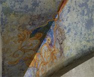
Here is a good example of the eroding condition of the buildings of Venice.


The Palazzo Fortuny's inner courtyard. The lower windows' roundels were lovely both indoors and out.


The Palazzo's exterior:


More neighborhood shots:


 The stucco colors are so vivid! 


Picture perfect, again!


Lots of spires and quatrefoils... and did I say water?


Toward the evening, the sun disappeared behind the clouds and it became windy and cold. Here, folks are beginning to scurry about to leave and take shelter.


Venice was just what you would expect... and more. I will return!


Next Sunday I'll show you around the Tuscan and Umbrian countryside.


Friday, November 5, 2010

Berlin's rough luxe


credit unknown


In a building almost destroyed in World War II, the Clarchens Ballhaus still attracts visitors from all over the world. It boasts a restaurant that was first opened in 1913, hosts concerts and theater groups and is a perfect place to enjoy views of Berlin from its garden. Its dance floor is the oldest in Berlin, with dancing Monday through Thursday evenings. Salsa anyone?


What first attracted me was its lack of pretense and pride in the building as it stood, rather than undergoing a major overhaul. I first came across the term "rough luxe" when used in reference to the London hotel, the Rough Luxe Hotel (see here).  I would be much more inspired sitting in its history, viewing the peeling walls and cracked mirrors.


I like it when you can experience the walls and floors as they have stood over time.


Love the chandelier!


What a place for the office holiday party!


Wednesday, November 3, 2010

True Blue


With all of the "natural" colors in design lately (grey, beige and greige variations), I find it refreshing to actually see color.

These gorgeous blue walls, paired with the classic white partner, create such an elegant space. Of course, the amazing moldings, fluted columns and paneling are the perfect complement to the intense blue color.


Above photos courtesy of Elegant Homes magazine. Photos by Timothy Bell.


The iconic John Stefanidis designed this dining room by interpreting the clear Egyptian blue in a layered manner. Offset by the white moldings, floor and accessories, it reads fresh and clean.


credit


And how could I leave without a tribute to Mark Rothko's blue composition. He was (and still is) the ultimate champion of color and nuance.


Mark Rothko's Untitled (Blue, Green and Brown), 1952
National Gallery of Art