Tuesday, December 28, 2010

Inspirations in the studio


This week I am returning to my paints and textures, working on several projects. I am loving it! I don't know about you, but my work output is greatly increased when I am inspired and there is nothing like peeking into other artists' studios to motivate me!

There are as many studio variations as there are artists. Here are a few:

-a studio with an elegant Aubusson carpet sample in the planning


-Studio of Carine de Marin in France


-Various painters at work


source unknown


-Jackson Pollock at work in his studio


credit


-Studios that are more organized or elegant


Wow!


-Paint palettes


Then, there is my studio! OK, I admit it. It IS messy, especially right now, in the middle of projects. If I had to clean up after every session, I'd get nothing done!


my drying brushes


pigments and colors


my work and class area


For those of you who know me, I always have to have a few plants and flowers around! Above, you will find birds-of-paradise and jasmine vines. This is an oleander passing the winter indoors.


Tell me about your favorite place to work and be inspired!


Friday, December 24, 2010

Have the happiest of holidays!


Sharing with you glimpses of our holiday decor this year. A few new baubles are added every year, but we prefer the traditional items for sentimental reasons. Some year we'll do something totally unexpected... and I suspect next year may be the year!


From the corner of the living room...


to the corner of the dining room...


to the Noble fir tree...


to the kitchen, where we hang out most of the time.


From the 50's lit stars and stephanotis vines...


to our carved wood, antique Santa (isn't he precious?)...


and his partner, the Man in the Moon...


to the vase of holiday greens...


Merry Christmas to my wonderful blogging friends all over the world!


Sunday, December 19, 2010

Arguably my favorite artist ever, Marcia Myers


When you see something for the first time and it speaks to your soul, you don't forget it. I'll never forget the first time that I saw a painting by an artist whom I had never heard of before. Was this painting a Rothko (my then current favorite)? It had such depth and character, but it wasn't quite his work. The colors were so vivid, the patina unmistakable. How was that achieved? Who was this artist? Luckily, Google came to the rescue and I discovered Marcia Myers. I soon owned the Hudson Hills Press publication named Marcia Myers Twenty Years: Paintings and Works on Paper 1982-2002 by Dr. Renee H. Shea. It is one gorgeous, oversized book that I refer to often.


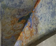
Marcia Myers was best known as a fresco artist who painted abstract canvases that reflected her love of Pompeii, the frescoes of the Renaissance and contemporary abstract paintings. She loved to experiment and developed a layered technique of combining unorthodox mediums with the traditional to produce the textured frescoes.


After completing her MFA in painting at George Washington University and a Fulbright scholarship,  Marcia began teaching Art History at the Madeira School in Virginia. She later credited her academic training, including classes on materials and methods, with giving her the confidence to push the limits with the mediums that she experimented with when creating her frescoes.

Marcia was deeply influenced by the ancient ruins in Pompeii and Herculaneum, making over thirty visits to study the frescoed walls. She strived to capture the incredibly rich colors and amazing textures, beginning with works on paper and later moving to large linen canvas.


Myers began painting with oils and pigments, layering thin layers of oil glazes and creating textures with paper and fabric. Works done by abstract painters, such as Mark Rothko and William Turner, were her early inspirations.   


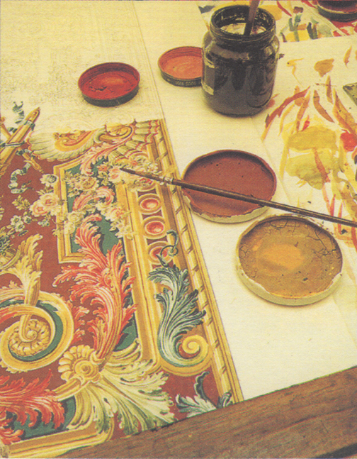
Myers continued to develop and refine her technique, using the raw, historical pigments favored by the Renaissance artists. She layered the pigments along with marble dust and clear acrylic varnish, combining many layers to achieve the luminous depths and vibrant colors that define her paintings.


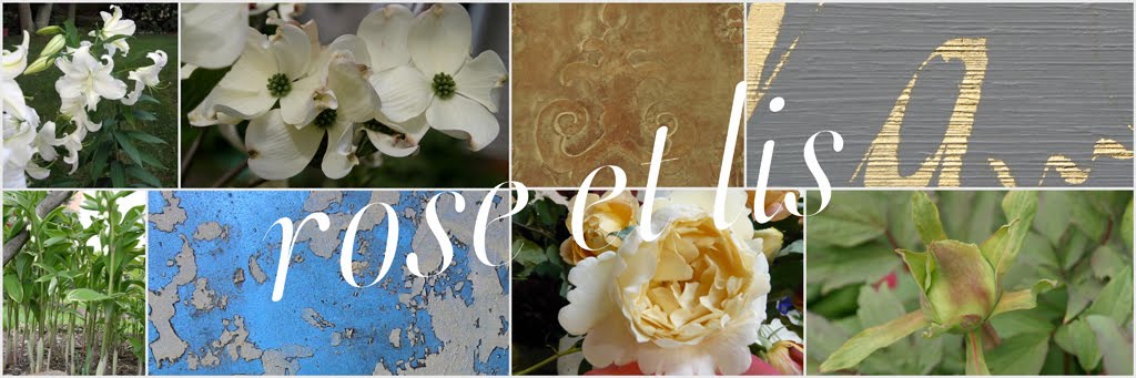
Myers started to paint in series, working on two or three canvases at one time, moving back and forth between them. These abstract diptychs and triptychs showed off her rich colors: burnished red-oranges, creamy whites, mustard yellows and cool turquoises and blues. 


Instead of layering the powder pigments into fresh plaster as in the frescoes of Pompeii and the Renaissance, she produced her frescoes by layering the pigments and marble dust on to clear varnishes and glazes, thus displaying a thoroughly modern take on the ancient medium. Using the powder pigments allowed her to make the most of each pigment's properties. While the ochres created a more opaque surface, the reds were more transparent. Lapis lazuli pigment stayed suspended in the medium, thus shimmering in light.


Marcia Myers' chipped and scraped surfaces continue to draw me in to contemplate and admire. 

What is your favorite? 


Marcia Myers died an untimely death in 2008. For those of you lucky enough to live close to the Gail Severn Gallery in Ketchum, Idaho, the Gallery is presenting Riches of Remembrance, a collection of Marcia's work. From December 20, 2010 through January 31, 2011, the paintings to be shown are mainly from her own personal collection.


Thursday, December 16, 2010

Guest posting at Providence Ltd. today


Providence Ltd.'s very talented designer, blogger and owner of a spectacular home (see it here), Mona Thompson, kindly invited me over to talk about holiday decorating. 

Let's go visit... 


Sunday, December 12, 2010

Holiday Gold in NYC


The holiday season seems to be especially hectic this year.  Between the trips here and there, holiday shopping and prepping, much less working, little time is left over to devote to blogging as I'd like to.

I often feel like this "scene" we caught on our trip to New York City last week:


Speaking of, we had the pleasure of visiting the new Fortuny showroom in the D and D Building. Designed by Barry Dixon, it was so fun to see the gorgeous fabrics that the Fortuny company continues to produce, closely honoring the designs and principles of Mariano Fortuny.


The walls and furniture, dressed with their lush fabrics, were beautiful. Fortuny also offers fabric-covered journals, address books and pillows- perfect for gift giving right now. You can see more pictures here.


I'll take the whole room!


My daughter treated us to an evening at the Metropolitan Opera to see Carmen. It was my first time at the Met Opera and it was a wow! evening. I admit that I am not an avid opera fan, but Carmen was amazing. However, the Met Opera House's gilded ceilings were my main attraction. (Figures, doesn't it?)


Not only were the soaring expanses covered with gold leaf,


seeing the gilded ceilings along with the Swarovski crystal chandeliers was a real treat. I kept on wondering how brave those artisans were to patiently apply each delicate gold leaf sheet while so high in the air.


We also went by the new Tamsen Z boutique on Madison Avenue, where I admired the perfect Venetian plaster walls.


 Look closely- do the chandeliers look familiar? Ann Ziff, the owner of Tamsen Z, had the Met Opera's crystal chandeliers duplicated for her shop.


I think we walked most areas of the city in our few days there. We pounded the pavement and made good use our Metro cards.


Down in SoHo, the Sicis store is an immediate attraction. Gorgeous tiles.


Cool panels.


The gold and blue together are a gorgeous combination. Now that's quite the tub!


There is no place like New York City. It's a great place to visit and get inspired, but I don't know how the folks live there. I am always glad to return home!