Showing posts with label Veranda magazine. Show all posts

Thursday, September 9, 2010

Fall color combos


As we stroll into fall, my color preferences often lean towards the more robust shades. I like to feature the colors in accessories, leaving me the option to replace them at a whim. My walls and main pieces of furniture are more neutral.

I am an aqua girl (way before this "year of turquoise"), so I fell in love with this great tile mask at first sight. It is from the Teotihuacan archaeological site in Mexico,  c.450. 


Just beautiful! The orange complements it nicely.


I thought that this was a lovely melange of colors.


Back to that aqua family- you cannot go wrong with turquoise accented with gold in a refined damask pattern.This is Designers Guild's Almaviva Turquoise fabric. 


The chair's luscious red velvet fabric and gold frame are striking against the raw concrete, gray walls. They set each other off.


The concrete walls (with hints of blue in them) also make a nice foil to the blue plaster walls. I have seen these walls used in a few advertisements. I assume it must be a rental location.


I had a client present me with a photo of a rug which she used as an inspiration starting point for her library. The blue and olive colors are almost a neutral- neither feminine or masculine. But they sure look good together.


Marais from Niba Rugs


Here is the finish I came up with- a custom colored, blue metallic plaster done in a raw silk texture background and a damask pattern with a custom olive plaster. What do you think? Did I interpret it close enough? I love the challenge of figuring out the steps to a finish and the more inspiration photos you can present your designer or painter with, the better.


A similar colorway is used in this classic urn.


One really cannot compete with Mother Nature's color combinations. We picked these flowers on Tuesday to use in floral arrangements. Dahlias, buddleia and one white with pink geranium stem for good measure; yes, you can use geraniums in a vase of flowers as long as the stems are conditioned.


What other color combinations do you like? 


Thank you, Cindy, at My Romantic Home, for Show and Tell Friday.

I am also linking up to Terrell's Fabulous Friday Finds over at Frou Frou Decor. Check out all of the ideas!


Tuesday, June 1, 2010

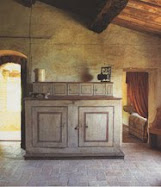
The limed wood finish


Limed wood furniture is increasingly popular and is being seen in many recent publications. Also known as the whitewashed finish, it originated in Europe in the 1500s to protect the wood pieces from worm. Slaked lime was applied to the wood which, inadvertently, also gave it the decorative finish that became in vogue. 


Italian Style by Jane Gordon-Clark

Luckily for us, we have less caustic ways of whitewashing. It is best to begin with a wood that has a more open grain, such as oak or ash. Other woods may be used, but they will whitewash differently, with the liming material collecting in the moldings rather than the grain.


 Photo by Nicolas Matheus in Cote Sud


One method involves applying a good furniture wax mixed with pigment; Liberon makes an excellent product called Liming Wax.  However, if the furniture is to be used in the kitchens, bathrooms or on floors where they will receive heavy use, this wax paste cannot be varnished for extra protection, so a water-based method would be used instead. 


Photo by Lu Jeffery in British Homes & Gardens


 With all of the excellent water-based products out now, this method would be the least caustic. I personally favor Stain and Seal by Faux Effects International.  I thin the stain until I am happy with the amount of "whitening" on the sample piece, apply it with a brush or cheesecloth and then wipe off until satisfied. Here is a beautiful room with the limed walls taking center stage.


 The New Eighteenth-Century Style by Michele Lalande


Great limed wood paneling in this John Saladino room!


Gotta love those plum walls!              Timeless Interiors by Barbara Stoeltie


Of course, you can just put the bare wood piece outdoors and let nature do its thing.


Photo by Nicolas Matheus in Cote Sud


Italian Style by Jane Gordon-Clark

I could not possibly end this post without reference to the now classic Veranda magazine cover with Edouard Vermeulen's pigmented, whitewashed wall:


I would call this perfection!


Veranda magazine

Friday, April 16, 2010

Friday Favorites: Aged Patinas

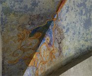
Aged patinas always catch my eye. It's a way to see into the past and appreciate the artistry of people before us. With all of the technology we have at our fingertips, don't you just wonder how they did it one hundred, five hundred, a thousand or two years ago?


Wednesday, March 17, 2010

What is scratch coat plaster anyway?

My favorite interior designer, John Saladino, recently featured scratch coat plaster walls in the January-February 2010 issue of Veranda magazine. The article, Saladino in SoHo, presented John’s designs, inspired by the Vermeer-based film Girl With a Pearl Earring, for the Veranda NYC show house.

Photography by Antoine Bootz in Veranda magazine


Photography by Antoine Bootz


Photography by Antoine Bootz


Saladino often features walls made with plaster that appear less “finished”.  He describes the walls as scratch-coat plaster or brown-coat plaster. What are they?

Back in the days before drywall, the walls in a home were made out of real plaster. The plaster application usually consisted of three steps: the scratch coat, followed by the brown coat and ended with the finish coat.

The first “scratch” coat (also called the intonaco) is embedded onto a wood lath (today metal lath is available which will not warp) and is the base coat. The scratch coat gets its name from the fact that it is physically scratched with horizontal marks. These scratches create the “key” for the next coat to grab onto. The second coat, the brown coat, is applied very thin and creates the flat surface for the finish coat. In Tuscany, this coat is called velo, meaning veil, since it is so thin. The final “finish” coat is a very thin coat that must be kept wet and troweled to a smooth, hard finish. When dry, it will be rock solid and shiny like marble. The finish coat is the thinnest of the coats, and its purpose is to impart a decorative surface to the plaster. The smoother the wall, the more labor involved.

Scratch, brown, and finish coats all have slightly different proportions. Scratch coats are mixed at 1 part cement to 2-1/4 to 4 parts sand, brown coats are mixed at 1 part cement to 3 to 5 parts sand, and finish coats are 1 part cement to 1-1/2 to 3 parts sand.

If you like that look, be sure to check out Saladino’s first book, Style by Saladino. It is full of similar looks. In one, he mixes instant coffee with the plaster and then dried it with the radiator turned on full blast to cause parts of the plaster to dry faster than others, causing the dried colors to vary.

Saladino's wall of brown scatch-coat plaster using
Saladino's wall of scatch-coat plaster using instant coffee with the plaster Photographer: Lizzie Himmel


Scratch coat plaster in John Saladino's book, Style by Saladino 


Axel Vervoordt, a fabulous Belgian designer, also favors walls that are more “natural”. Here he mixes lime with powder pigments and earth found locally on the property. Scratch coat plaster walls and these lime and pigment walls are both ancient and modern... and very "green".

From Axel Vervoordt's book, Timeless Interiors