As we stroll into fall, my color preferences often lean towards the more robust shades. I like to feature the colors in accessories, leaving me the option to replace them at a whim. My walls and main pieces of furniture are more neutral.
I am an aqua girl (way before this "year of turquoise"), so I fell in love with this great tile mask at first sight. It is from the Teotihuacan archaeological site in Mexico, c.450.
Veranda Magazine via the Museo Nacional de Antroplogia in Mexico
Just beautiful! The orange complements it nicely.
Veranda Magazine via the Museo Nacional de Antroplogia in Mexico
I thought that this was a lovely melange of colors.
Back to that aqua family- you cannot go wrong with turquoise accented with gold in a refined damask pattern.This is Designers Guild's Almaviva Turquoise fabric.
The chair's luscious red velvet fabric and gold frame are striking against the raw concrete, gray walls. They set each other off.
The concrete walls (with hints of blue in them) also make a nice foil to the blue plaster walls. I have seen these walls used in a few advertisements. I assume it must be a rental location.
I had a client present me with a photo of a rug which she used as an inspiration starting point for her library. The blue and olive colors are almost a neutral- neither feminine or masculine. But they sure look good together.
Marais from Niba Rugs
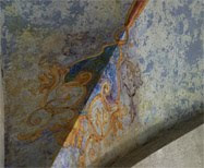
Here is the finish I came up with- a custom colored, blue metallic plaster done in a raw silk texture background and a damask pattern with a custom olive plaster. What do you think? Did I interpret it close enough? I love the challenge of figuring out the steps to a finish and the more inspiration photos you can present your designer or painter with, the better.
A similar colorway is used in this classic urn.
One really cannot compete with Mother Nature's color combinations. We picked these flowers on Tuesday to use in floral arrangements. Dahlias, buddleia and one white with pink geranium stem for good measure; yes, you can use geraniums in a vase of flowers as long as the stems are conditioned.
What other color combinations do you like?
Thank you, Cindy, at My Romantic Home, for Show and Tell Friday.
I am also linking up to Terrell's Fabulous Friday Finds over at Frou Frou Decor. Check out all of the ideas!
I am also linking up to Terrell's Fabulous Friday Finds over at Frou Frou Decor. Check out all of the ideas!
+web.jpg)









Love the custom blue metallic plaster finish. You're just so good! Did you get my E-mail about the name to go on my blogroll?
ReplyDeleteI like peacock blue and emerald green. I also love navy and mustard yellow. Cherry red and sky or haint blue. Pink and orange is always delightful as well. Just like this post! XO, Kelly
ReplyDeleteLove those doors!! I'm always looking for color inspiration to get me out of the rut. Thank you for sharing!
ReplyDeleteHi Ann, thank you for inviting me to visit your blog! :)))))
ReplyDeleteLove blue and olive together, in the right shade they are very elegant.
ReplyDelete